

Entertainment
HYBE’s CORTIS Faces Backlash Over Lightstick’s Similarity to B.I’s BINBONG

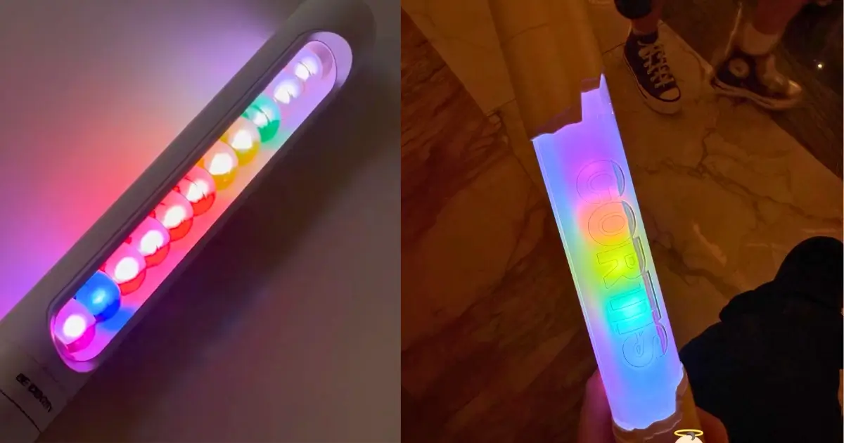
K-pop lightsticks are more than concert accessories. They represent an artist’s identity and serve as symbols of pride for their fandoms. HYBE and BigHit Music are now facing criticism after CORTIS’ official light stick was revealed with a design that closely resembles B.I’s BINBONG.
Side-by-side photos and videos circulated across social media as fans compared the two products. The similarities are not limited to a white handle or LED lighting, which are common among K-pop lightsticks.
Both designs use a straight cylindrical body, a transparent center, bead-shaped light elements and a rainbow color mode that appears to work in nearly the same way.
Each feature may appear common on its own. However, when combined in one design, the result looks more like a modified version of BINBONG than a completely original concept.
CORTIS may have different branding and logos, but those changes do not remove the similarities in the shape, lighting and overall design.
Videos of the two lightsticks while turned on made the comparison even harder to ignore. Fans pointed to the similar arrangement of the internal lights and the rainbow effect passing through the transparent body.
The issue is not one isolated feature. It is the use of several recognizable elements from BINBONG in a single product.
An x user described the comparison as “B.I versus AI,” contrasting a concept built around an artist’s personal interests with a newer design that appears copied and stripped of its original meaning.
The similarities become more meaningful when the story behind BINBONG is considered.
The lightstick was inspired by Hanbin’s favorite movie, Pixar’s Inside Out, and his favorite character, Bing Bong. The colorful marbles inside its transparent body represent the core memories featured in the film.
The name BINBONG also connects Bing Bong with B.I’s birth name, Kim Hanbin.
These details show that BINBONG’s clear body, colored marbles and lighting were carefully chosen as part of a concept personally connected to B.I rather than added solely for design purposes.
This is why B.I’s fans believe the similarities go beyond a common K-pop lightstick trend.
CORTIS’ lightstick shares several features that make BINBONG recognizable, including its straight shape, transparent body, bead-like elements and rainbow lighting.
For many fans, HYBE appears to have reused the most distinctive parts of BINBONG’s design without the personal meaning behind B.I’s original concept.
The controversy has raised questions about HYBE and BigHit Music’s creative process.
HYBE is one of the largest entertainment companies in South Korea. It has the budget, staff and industry influence to develop original merchandise for its artists. Despite those resources, CORTIS was given a lightstick that can be immediately compared to a product released years earlier.
That is not simply unfortunate design overlap. It reflects a lack of creative judgment from the teams that developed, reviewed and approved the final product.
The criticism should not be directed at the CORTIS members. They are not responsible for the company’s merchandise decisions.
If anything, the group has also been failed by the creative team. CORTIS deserved a lightstick based on its own music, image and relationship with its fandom. Instead, the members were given a product now associated with copying accusations.
Several users also criticized K-pop fans who appeared to be turning a blind eye to the resemblance because CORTIS is under HYBE.
Despite the side-by-side photos and videos showing the same overall shape, bead-like interior and rainbow lighting mode, some continued to dismiss the comparison.
Others argued that the reaction might have been different if a smaller company had released merchandise that closely resembled a product from a HYBE artist.
Ignoring the comparison does not make the similarities disappear. The evidence is already visible in the products themselves.
The design also appears inconsistent with the identity BigHit Music has built for CORTIS.
The group’s name comes from the phrase “Color Outside the Lines,” which is meant to represent originality, free thinking and moving beyond established standards.
That message loses credibility when one of the group’s main official products appears heavily based on another artist’s existing merchandise.
For a group presented as creative and original, its lightstick should have had a clearer identity of its own instead of drawing immediate comparisons to BINBONG.
The social media comparisons do not prove plagiarism in a legal sense. Still, the similarities are clear enough for audiences to question whether the design was truly original.
The straight body, transparent center, bead-shaped lights and rainbow mode are all features closely associated with BINBONG. Fans have also explained how these details are tied to B.I’s personal concept.
Instead of strengthening CORTIS’ image as a creative group, the lightstick has raised concerns about the company’s lack of originality.
CORTIS deserved merchandise with a distinct identity. Instead, HYBE approved a design that immediately reminded people of another artist’s existing product.
With the resources available to HYBE and BigHit Music, was copying an existing concept really the best they could produce?
